| This article originally appeared in the September 1992 (volume VIII #1) issue of “Experimental Musical Instruments”, published from Nicasio, CA. Page 18-22 |
Introduction
The technique of designing musical instruments has not changed much in the last several thousand years. A maker builds an instrument, listens to the tone, then repeats the entire process with a slight change in construction. This is a tedious process and one often thinks that it could be easier if there was a way to “see” the sound. Spectrum analysis is a tool that gives us the ability to see the timbre. In this article we will discuss its various aspects; including sampling theory, processing, and graphic output.
Background
The graphic representation of sound has been an area of interest for years. The earliest experiments focused beams of light against a mirror which was attached to a vibrating object. This technique was used extensively until the twentieth century when the oscilloscope was invented. Both light beams and oscilloscopes give a graphic representation of the vibratory nature of sound.
Musical sounds are usually visualized as “waves” of air that vibrate with a particular frequency. This frequency is expressed in cycles per second; however, instead of saying “cycles per second” we say “Hertz”. The range of human hearing is said to extend from 20 Hertz to 20 Kilohertz (i.e., 20 cycles to 20,000 cycles-per-second). This range is referred to as the “audio spectrum”.
However, day-to-day sounds and musical sounds consist of a mixture of different frequencies. It is the nature of this mix which helps to determine timbre. Therefore, by looking closely at these component frequencies we get insight into the timbre of any sound. This is spectrum analysis.
The pioneer of spectrum analysis was undoubtedly Hermann von Helmholtz. He developed a series of hollow glass spheres with carefully calibrated resonance frequencies. They would vibrate when excited by the appropriate frequency and one could hear this by placing them against the ear. It was a very tedious process, but with these simple devices he was a pioneer in the field.
The Helmholtz resonators had their problems. The were awkward and the lack of a graphic output meant that only a subjective evaluation of the component frequencies was possible. By the later part of this century they were replaced by totally electronic techniques. Unfortunately, they were very expensive.
However today these once expensive spectrum analyzers are within the reach of the average instrument maker. This is a consequence of the rapid drop in the price of digital electronics. $200 and a personal computer is all that one requires to enter the world of spectrum analysis. Table 1 is a small list of available packages. (NOTE – This article was published in 1992. Products and pricing are not current.)
TABLE 1
| PRODUCT NAME | HARDWARE ENVIRONMENT | MANUFACTURER | STREET PRICE | COMMENTS |
| Digital Sound Studio | Amiga | Great Valley Products | $100 | Hardware / Software |
| Compuscope / GageCalc | IBM | Gage Applied Sciences | N/A | Hardware / Software |
| MacRecorder Sound System | Macintosh | Macromind | $175 | Hardware / Software |
| MacRecorder Pro | Macintosh | Macromind | $240 | Hardware / Software |
| Alchemy | Macintosh | Passport Designs | $695 | Software only |
We have briefly reviewed what spectrum analysis is. It would be very appropriate to discuss the technical details. One of the most fundamental is the process of taking the sound and putting it into the computer. This is a subject known as sampling.
Sampling
If the computer is going to do our work, we have to find some way to get the music into the computer. The hardware and software, with all of the myriad of technical considerations has been the topic of numerous books, and dissertations. However the essentials are surprisingly simple.
The hardware in our sampling process revolves around a specialized peripheral called an Analog-to-Digital converter. This device, usually called A/D converter for short is responsible for taking the analog signal and converting it into discrete numbers that the computer can process. These discrete numbers are our samples
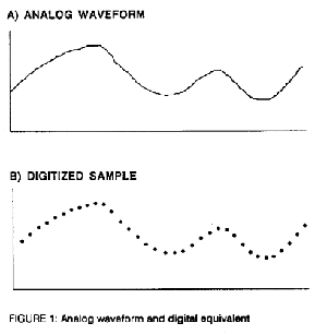
The concept behind sampling is quite simple. The waveform in figure1-A can be sampled and expressed as figure 1-B. This is similar to the operation of a motion picture camera. Just as an event may be captured on film as a series of still frames, so too an audio signal may be captured as a series of discrete values.
The concept may be quite simple but the implementation may be quite complicated. There are a number of factors which must be kept in mind. The two most important are the sampling rate and the resolution.
The sampling rate is an option on most computer systems. But how fast should it be?
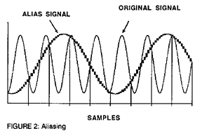
We must turn to the Nyquist theorem to help us find the correct sampling rate. It tells us that the sampling rate must be greater then twice the highest frequency to be encountered. Any attempt to sample at a lower rate results in a phenomena known as aliasing.
Aliasing is where the frequencies above the Nyquist point (half the sampling rate) become reflected back down the audio spectrum. This is illustrated in figure 2. It is very much like the movement of the wheels in the old films. If the wheels were moving slowly, the camera has no trouble “sampling” the event. However, as the wheels go faster the apparent motion tends to slow down. At a certain point the wheel appears to stop, thereafter it appears to go backwards. This apparent retrograde motion of the wheels is analogous to the aliasing which occurs in digitized audio signals.
The resolution is another consideration. Most low cost systems default to eight bits. An 8-bit code has 256 possible combinations. Therefore the maximum resolution that one could expect from an 8-bit code is 256 steps. There are systems which are capable of processing up to 16-bit codes. This gives 65,536 possible steps! However these systems cost more than the average instrument maker would be willing to spend. For the purposes of the average craftsman an 8-bit resolution is quite sufficient.
This digitizing process, with all of its considerations is the first step. However merely putting the information into the computer is insufficient to produce any useful result. The data must be processed to yield the frequency information.
Processing
The key to spectrum analysis lies in the computer processes. These processes are variations upon an extremely complicated field of mathematics known as Fourier transforms. The utility of the Fourier transform is underscored by the failure of simpler methods to yield clear information about musical timbre.
The oscilloscope is a classic example of the inadequacy of a simpler technology. Virtually any instrument maker can afford to purchase an oscilloscope. Yet the images that appear fail to give much information about timbre. It fails because the oscilloscope functions in what is called “Time domain” while our perception of timbre depends upon something called “Frequency domain”. These are referred to as “inverse domains” of each other.
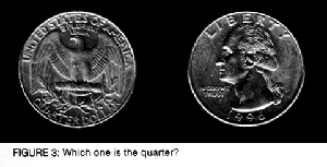
The concept of the inverse domain may sound very intimidating but it is based upon a simple idea. Let us begin by looking at figure 3. Here is a simple question. Which one is the quarter? We know that both images represent the same object even though they look absolutely nothing alike. Once we accept the fact that totally different images may represent the same object, we have made the first conceptual breakthrough in the understanding of inverse domains.
A further understanding of inverse domains is seen in common wall current. Wall current (60Hz, 120V) is graphically shown by the two diagrams in figure four. Figure 4-A shows voltage as a function of time. This is the standard sine wave which is familiar to most people. Figure 4-B shows voltage with respect to frequency. This shows a single spectral line at 60Hz. It does not require a strong technical or mathematical background to see that both of these diagrams represent the same phenomenon.
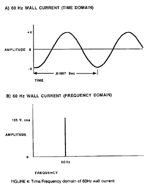
The reason that these two representations are referred to as inverse domains is equally simple. The time domain diagram (fig. 4-A) shows the period as being .01667 sec. The Frequency domain (fig. 4B) shows the frequency as being 60Hz. The relationship is simple:

We see that this is a simple reciprocal relationship. It is because of this simple relationship that they are called inverse domains.
Unfortunately, the real world conditions do not allow us to take a simple reciprocal and obtain our spectra. To derive spectra from complex sounds we are forced to perform what is called a Fourier transform.
The Fourier transform may be visualized as a magic “Black Box” which is able to convert time domain to frequency domain. There are numerous algorithms to accomplish, however the most common is an algorithm known as the “Fast Fourier Transform”. This particular algorithm is usually abbreviated as FFT. The FFT is the most commonly used algorithm for small computer systems.
The Fourier transform was developed by Jean Baptiste Joseph Fourier in the beginning of the 19th century. The life of Fourier would make an interesting book in its own right. He was successful at politics, sciences, and mathematics. It is also curious that the mathematical process that made him immortal was not developed for acoustics. It was instead developed during the course of his work on thermodynamics. However to us it is his “black box” that converts time domain to frequency domain which is important.
Although the Fourier transform may be visualized as “black box” there are still some considerations which should be observed. Primarily we need to keep in mind the effects of our sample.
The size of the sample is extremely important. This is because the amount of information which goes into the process is going to be the same as the information which comes out. The Fourier transform merely changes the form of the information. It does not generate nor destroy information. Therefore a larger sample will give us a higher frequency resolution. Let us say that we transform a sample which has 1024 points. Our output will have 512 frequency bands.
At this point the attentive reader will be saying “Hey, that is only half the information which went into the transform. Where did the other information go?” This would be a convenient place to zoom into the stratosphere with an esoteric discussion of imaginary numbers, but we will not do that. The simple fact is that the other half of the information is the phase relationship of the various frequency bands. Therefore the 1024 point sample was transformed into 512 frequency bands and the corresponding 512 phase relationships. However, this phase information is generally ignored.
There are situations when a characteristic of the sample produces a frequency which is not in the original. This is called an artifact. Aliasing is one example of an artifact.
There is another artifact which is particularly troublesome for the Fourier transform. This arises when the sample does not correspond to an even number of periods. We find that the Fourier transform presumes that it is dealing with an even number of periods and generates the frequency information accordingly. Therefore the presumed waveform from the sample in figure 5-A would be the waveform in figure 5-B
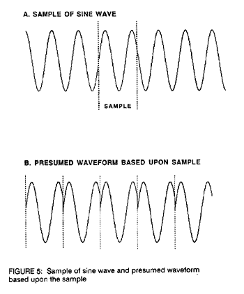
This artifact points to a fundamental weakness of the Fourier transform. The process presumes that there is a repeating pattern and that the sample conforms to an even number of periods.
Unfortunately, real world sounds tend to show an absence of such simple repeating patterns. This absence is usually derived from several mechanisms. The first is a random component in the sound (i.e., white noise). The another is the effect of the envelope (i.e., the attack and decay of the sound). And another deals with different envelopes for each component frequency. Although such fundamental inconsistencies exist between the presumptions of the Fourier transform and the real world, this does not weaken the value of the process. It merely means that we must be conscious of the artifacts and how they may influence our final results.
Usually these artifacts are of such a low amplitude that we do not need to worry about them. However, if one suspects that an area of interest may be an artifact, the easiest thing to do is to resample with a different sample size. If the particular component shows wide variation, it is probably an artifact. If it shows a certain consistency then it is probably a legitimate component.
We have seen that the Fourier transform is the major tool by which we are able to obtain the frequency information from a sample. We have also shown that there are certain considerations which should be observed if the transform is to be reliable. However we have not discussed one of the most important aspects of the process. That is the graphic representation of the information.
Output
The output of the spectrum analyzer is of prime importance. This is what is going to be interpreted by the instrument maker. An unintelligible output renders the whole system worthless.
Undoubtedly a simple numeric table would be the most fundamental computer output. After all, the Fourier transform is just a mathematical process which takes in number and spits out numbers. Unfortuanately, this is not an intuitive way to read the data. It is for this reason that a numeric output is not common for spectrum analyzers.
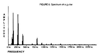
The simple X/Y plot is the most common form of output. This simply plots the data from the Fourier transform in standard Cartesian coordinates. The X axis is conventionally fixed as frequency and the Y axis is conventionally fixed as the amplitude. Furthermore there is a tendency to “fill” the diagram to make it visually more appealing. Figure 6 is a typical X/Y spectrum of a guitar with a black fill.
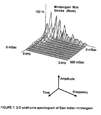
The simple X/Y has one disadvantage. It does not have the ability to show how the spectrum changes with respect to time. It is a characteristic of acoustic instruments that the spectrum is not fixed but changes over the course of time. If we take repetitive samples and plot them on the Z axis, then we can better illustrate the timbre of an instrument.
This is the principal behind the 3-D wireframe. In figure 7 we see a 3-D representation of the sound of a mridangam. There are several characteristics which may be seen that would not be apparent in a simple X/Y plot. For instance there is a moderate component of white noise (random vibration) in the initial sounding. This is indicated by the unusually broad peaks and the large degree of filling between them. The initial spectrum very quickly dies away and is replaced by a relatively stable 2nd, 3rd, and 4th harmonic. There is a peak in the second harmonic at an unusually long period after the drum was excited. All of these are characteristics which are clear when viewed as an 3-D wireframe but would not be so evident in a simple X/Y plot.
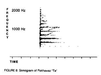
There is another way to represent the same information in a 2-D format. This is in the form of a “sonogram”. This particular form of representation gained wide popularity in the pre-computer era because it lent itself well to analog techniques of spectrum analysis. This technique uses the X axis to display time and the Y axis to portray frequency. The amplitude is denoted by the darkness of the print. This method is still in use today in voice-print analysis, however for virtually all other applications it is on the decline.
All of the previous examples utilized a linear method of presenting the information. That is to say that each unit of time or voltage corresponded to a single unit of vertical or horizontal displacement. However, this one-to-one relationship is inconsistent with human perception.
Haven’t you always wondered why when you walk into a dark room and turn on a light it gets bright but when you turn on two lights it doesn’t get twice as bright. This is because human perception is not linear. Sometimes spectrum analyzers allow you to look at the spectrum in a non linear fashion somewhat analogous to the way we hear. This is referred to as a power spectrum while the normal linear graph is referred to as a normal spectrum. Figure 9 (A & B) shows both the normal spectrum and the power spectrum of steel drums.
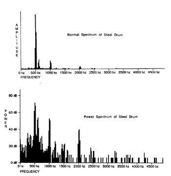
It is apparent that that the power spectrum shows much more detail than the normal spectrum. Unfortunately it takes some practice to properly interpret the relative values of the component frequencies. The choice between displaying the power spectra or normal spectra is often a question of personal choice.
We may summarize the whole topic of output quite simply. Although the output from the Fourier transform must be numeric, virtually every package gives a graphic output. These may a standard X/Y plot, the older spectrogram, or the much more attractive 3-D wireframe.
Conclusion
Spectrum analyzers are not out of the reach of the common man. Software/ hardware packages are now in the range where almost anybody can afford one. However, the complexity of the subject still means that there has to be a certain attention to detail. If the nature of sampling and the quirks of the Fourier transform are known, it may be a useful tool for virtually any serious instrument builder, especially with an appropriate graphic output.